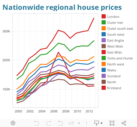
Take a look at this chart that was recently featured in the Guardian. Its looking at the change of average house prices in the UK, split by region.
It shows that prior to the credit crunch house prices across the UK were steadily increasing, then in 2009 all the prices dipped and are now recovering. However there is one major flaw in this chart. The use of a 6 colour palette when there are actually 13 dimensions. This has the effect that the colours are used twice, and in one case 3 times. So you have London, East Mids and N Ireland all using the red line. So its no impossible to pick out which is which. The chart software they have used doesn't allow you to select the region name in the legend and then highlight the relevant line. This becomes a problem when the biggest question i wanted to ask was, "Wow, what region had that massive spike and why is that region declined where every other one has increased." I cannot answer that question at all.
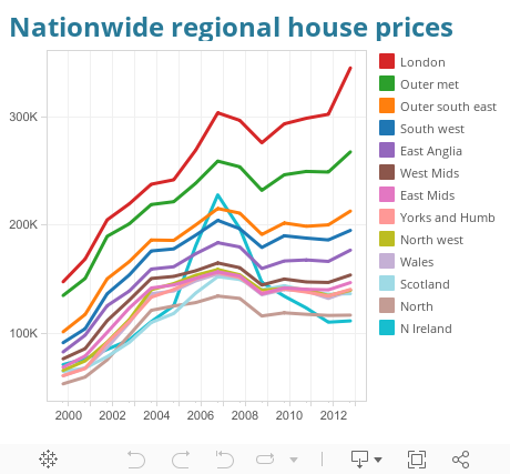
So if we download the data and drop it into Tableau we can produce this, using the same colour palette
Already this is an improvement as we can select the region name from the legend and it highlights the name in the chart, and now we can see that its N Ireland that had that large spike and then the rapid decline. Thats the real story in the data, the exception.
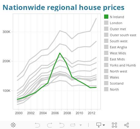
We can go one further by changing the palette to the Tableau 20 put some information in the tool tip and now we get a chart that lets us actually find the story in the data.
Hopefully this shows why its important to be careful when you select your colours. You are potentially missing out on showing the most interesting part of the story, and after all , that's the whole point of the viz in the first place.

Tableau Zen Master, Social Ambassador, Wrangler of Data, Vizzer of Data

0 comments :
Post a Comment