I’ve thrown together a Gantt chart and I want to add a “peak” portion in the middle of each bar. So each bar represents a project… let’s say for example Project A lasts from 4/1/14 through 4/15/14. Well I want that bar to be a light color, aside from the “peak” portion that’s a shade darker… let’s say 4/7/14 through 4/9/14. So each bar would show the entire time that the project is “active” but it will also show where a team member is busiest with that project.This is what the original looked like

The data included the project start and end dates along with a peak start and end date. These dates were used to create two calculated fields for Project Duration and Peak Duration.
My initial thought was could you create a dual axis gantt chart and overlay the peak durations over the top of the project durations already on the chart.
First right drag the Peak begin date to the column shelf and select the continuous day.

Next select dual axis and then synchronise the axis so that the two sets of marks overlap each other.
At the moment the peak gantt chart is using the project duration as the length of the bars so drag the peak duration measure onto the size shelf of the Peak Begin chart.

Finally change the transparency of the colours of the project gantt so that they are a lighter shade

And now your chart should look something like this

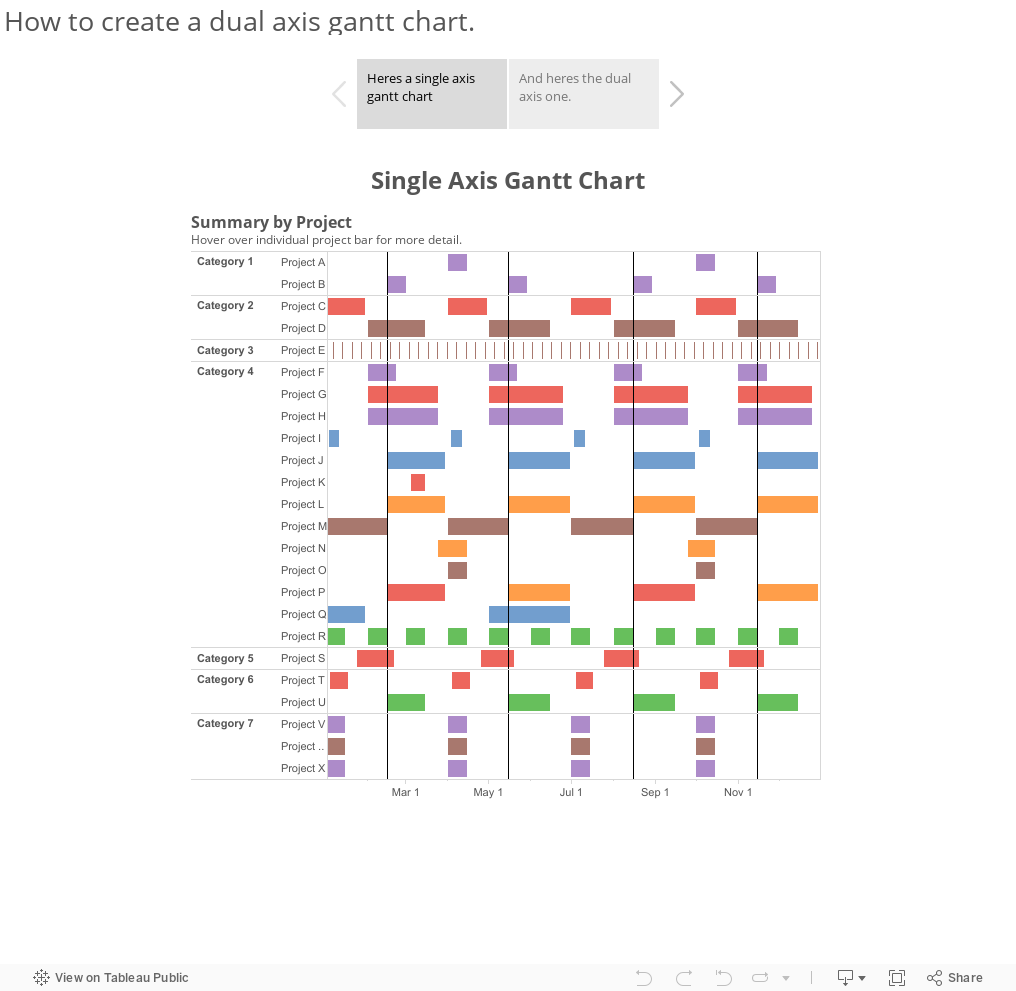

Tableau Zen Master, Social Ambassador, Wrangler of Data, Vizzer of Data

Tableau online training| Tableau training| call us+ ...
ReplyDeletewww.21cssindia.com/courses/tableau-online-training-226.html
tableau online training, tableau training, tableau course contents, tableau, tableau enquiry, tableau training institute india, andhra pradesh, visakhapatnam, call ... Call Us +919000444287 or contact@21cssindia.com
Is there a gantt chart software to be used for creating amazing gantt charts likes these. I'm been searching for one online.
ReplyDeleteHello
ReplyDeleteCan you please share the excel data file for this Gantt chart
Thx
ReplyDeleteI appreciate your work on Tableau. It's such a wonderful read on Tableau course. Keep sharing stuffs like this. I am also educating people on similar Tableau training so if you are interested to know more you can watch this Tableau tutorial:
https://www.youtube.com/watch?v=ZB78DglzyZY
This article is worthy of attention
ReplyDeleteEscorts London Agencies